Castle Games

Castle, portal, everyone
Castle Games is an app allowing users to build and share their own games. It acts as a portal between reality and virtuality, inviting people going into the world of imagination. Strating from the app icon, our desing goal is to build the brand wondrous but not childish, adventurous but not violent, charming and mysterious.

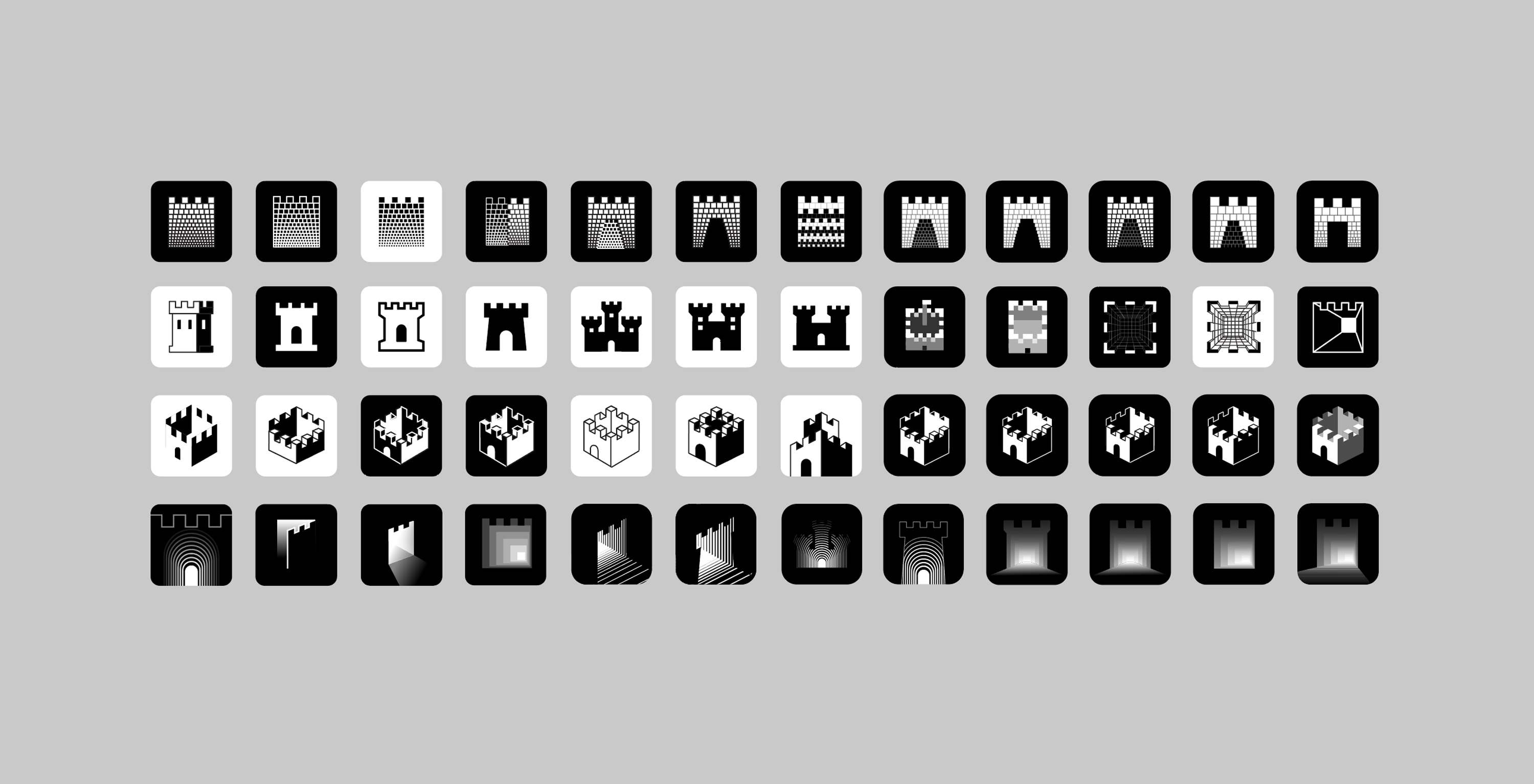

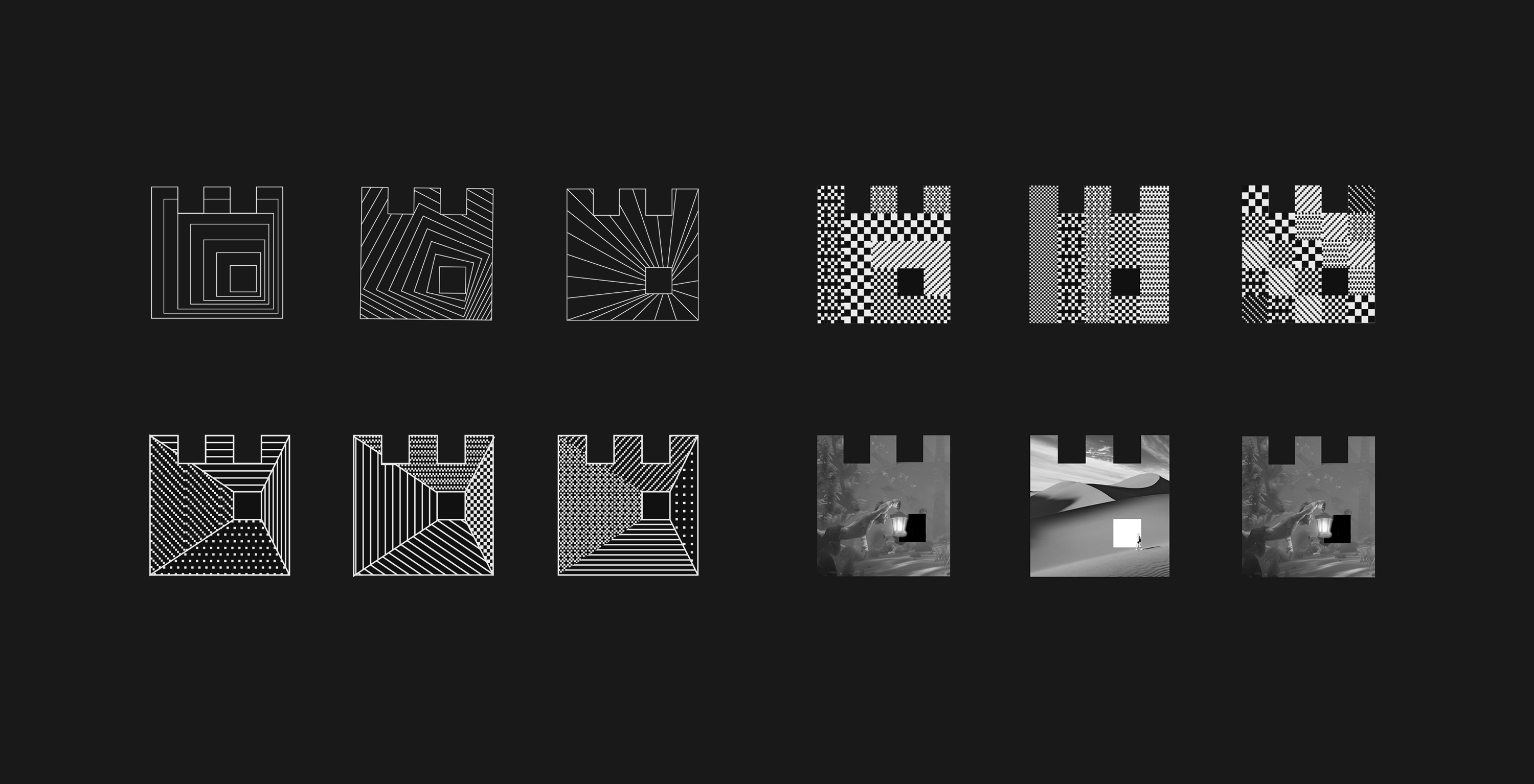
From M.C. Eshcer to a maze
We started a series of explorations on how the app icon should look like. One of the directions draws inspiration from M.C. Escher’s unrealistic optical effects, showing one image that contains multiple
perspectives, with high-contrasted light and darkness to create the illusion between reality and virtual space. Another direction with different shades of light indicating the motion of coming close to a portal. The other interesting exploration is using repetitive lines to create depth of field and an optical and mysterious tunnel-like experience. After rounds and rounds of explorations, and the consideration of legibility on a small app icon, we land on a maze-look castle with the visual meanings of both a portal and a game.
Amazing David Cole who I work with at Castle also writes up a whole thread on the evolution of the logo.
A bit weird and unexpected
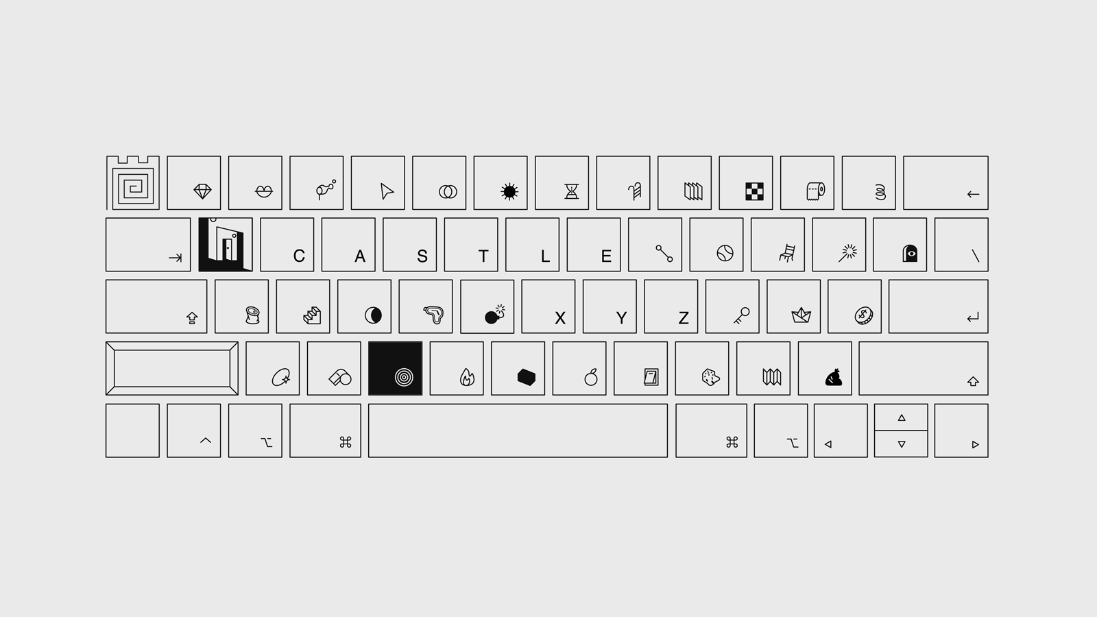
There are 64 keys on a keyboard, but with these limited keys, there are almost infinite amount of stories that’ve been published and numerous worlds that’ve been built. A tangible object like keyboard is introduced to represent the concept of “everyone having the ability to create from the most basic tool”. There are no familiar characters on this keyboard, instead, mysterious symbols and functional icons such as bomb, coin, and trash take place to show the composition and the wit of a game. This becomes the key visual for Castle to use on social media.
Design│David Cole, Joro Chen